Topic 1: Data Visualisation
What is data visualisation?
Data visualisation is an interdisciplinary field that deals with the visual representation of data. The primary goal of data visualisation is to make it easier to assess smaller facets of the larger picture, such as identifying outliers, patterns, and trends in complex data.
Data visualisation is one of the fundamental steps of the data science process; it happens after data has been collected and processed, and before and after data is modelled. Data must be visualised and interpreted for conclusions to be made. In health and social care, data visualisation is essential for analysing massive amounts of service users’ and administrative data and for data-driven decision-making within and across health and social care organisations.
Data visualisation provides:
an effective means of communicating data to non-technical (and technical) audiences using visual information a way to better engage audiences with crucial and understandable information a mechanism to present data so that actionable data can be absorbed quickly for greater insights and faster decision-making Different types of data visualisation
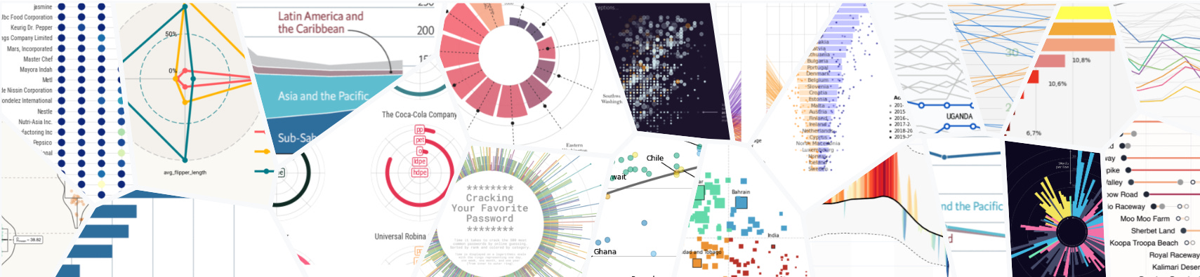
Charts can be considered a catch-all term for data visualisations of all varieties, such as those shown above.
Figures are visuals that use varied forms and dimensions, including shapes, colours, sizes, and locations. Graphs are a common type of figure where information is presented in two dimensions: the x-axis (horizontal) and y-axis (vertical). Figures which are not graphs may be referred to as plots and include maps and Venn diagrams.
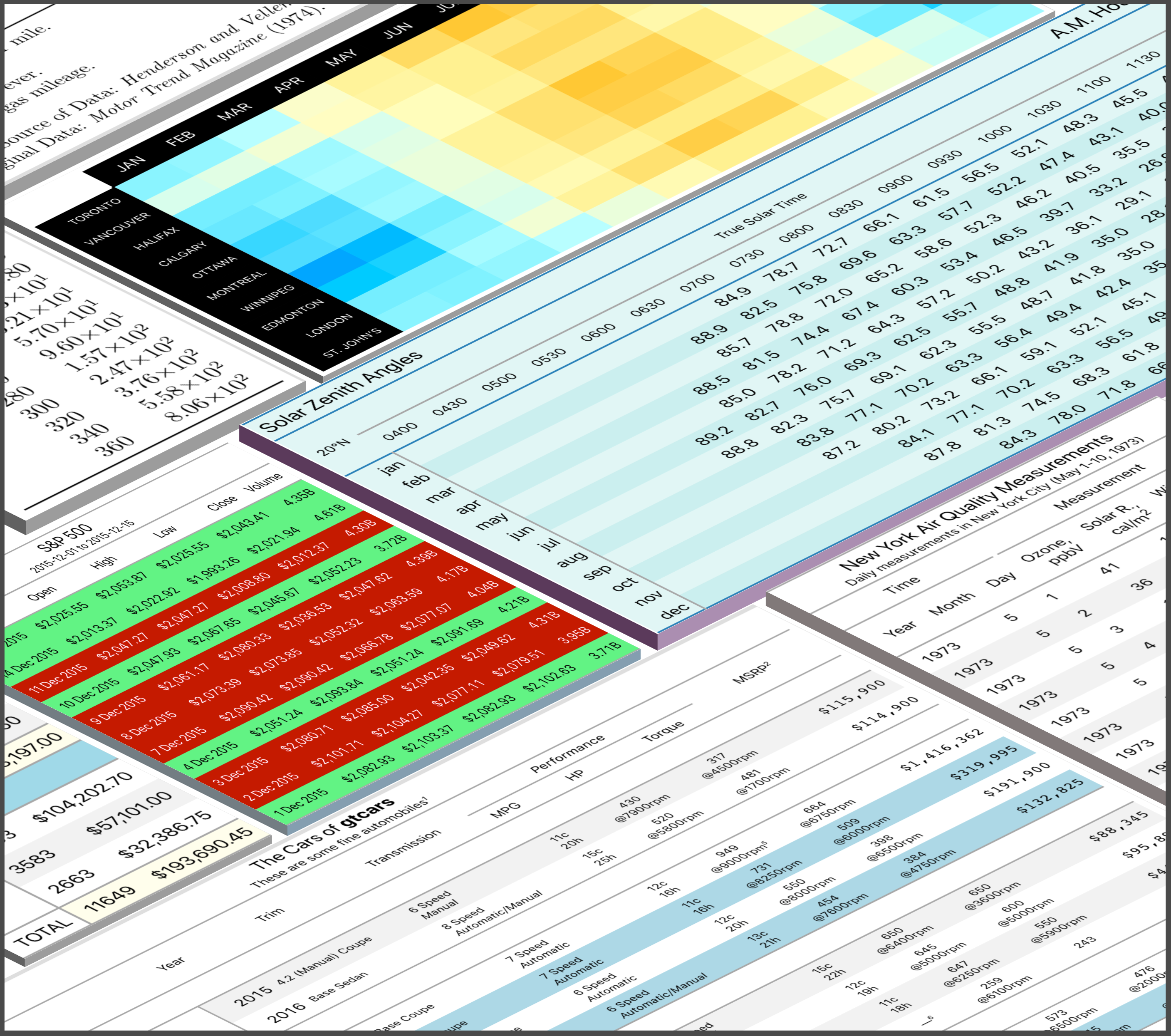
While tables tend not to be as colourful or eye-catching as other visuals, they can be used to clearly present large quantities of summary information. They are particularly useful when precision is required, such as when determining whether one value is higher than another.
An infographic is a combination of text, tables, and/or figures, is explicitly designed to guide the audience to a particular conclusion (the art known as graphical storytelling). They are often used as posters in marketing and research outreach to summarise the key themes of a suite of analyses. On the other hand, dashboards present data as objectively as possible to allow the audience to overview information at a glance.
Data visualisation tools in data science
Not meant to be an exhaustive list in any way, some of the most popular data visualisation tools are outlined below.
Microsoft Excel
The most simple tool for data visualisation for many of you will be using a piece of software you should all be familiar with: Microsoft Excel. Excel originally offered nine simple plot types: bar graphs, line graphs, pie charts, hierarchy charts, histograms, scatter plots, waterfall plots (usually used in financial analyses), maps, and tables (or pivot charts). Newer versions of Excel (2016 onward) offer a wider variety of chart types and templates.
Tableau
Tableau is a visual analytics platform that has drawn real traction in the last few years. Tableau has become very popular in industry because it is intuitive with a point-and-click interface and looks professional. Although the cost is relatively high, there is a 1-year free trial available for students, so this is a great time to get familiar with the software if you are interested. Here are a couple of graphs produced in under ten minutes. Tableau also has a gallery to browse, including Viz of the day.
Python
Python is a free, open-source programming language that can be used to conduct more complex analyses than Excel, and to create more customised tables and figures. matplotlib and seaborn are packages within Python that are designed to create nice-looking plots using default settings to minimise the necessary code. The matplotlib examples gallery and seaborn examples gallery show some of the plots you can make using the packages and provide the code to allow you to replicate it. Additionally, the Python Graph Gallery is an excellent resource with a collection of 100s of charts made with Python, as well as sections dedicated to more general topics like matplotlib or seaborn packages.
R
R, like Python, is another free, open-source programming language with great graphing abilities and will be the primary language used for this course. The package ggplot2 can be used to make most plot types within the core package. There are over 136 extension packages which have been developed to date, meaning the plot options are essentially endless! R Graph Gallery and the newer R Charts are both great websites to get some inspiration for what is possible with R and with ggplot2 and show both examples and code for various plots.
Examples of good data visualisation in health and social care
Data visualisation is storytelling with a purpose. Good data visualisation tells a story by removing the noise from data and highlighting valuable information: it’s a delicate balancing act between form and function. The plainest graph could be too dull to catch any notice, or the most beautiful visualisation could utterly fail because it conveys too much information or fails to make a point. For good data visualisation, data and visuals need to work in tandem. Data visualisation needs to provide context, draw attention to key insights, and support the decision-making process. However, the real magic happens when data visualisation is driven by storytelling.
Louisiana vaccine rate versus infection
To facilitate timely and informative research during the COVID-19 pandemic, vast quantities of data were made freely and easily available for download. While this data was primarily used by news crews, policy and decision-makers, and researchers to provide the necessary context to a rapidly evolving situation, it was also used by many amateur data analysts to hone their skills and share their insights.

This graph made by Reddit user zkanalog highlights the states with low vaccination rates and how much of an outlier Florida was, with its particularly large outbreak (almost 1% of the state population infected in that month alone). There are a few factors that make this a great graph. First, the graph is really well labelled: the axes, the title (typo aside), the captions, and even the annotations on specific points of the scatter plot. The data source is also clearly explained in detail in the caption on the left. While it has not been listed in any of the captions, which is not ideal, the use of colour to mirror the x-axis, and size to mirror the y-axis, adds some visual appeal to the plot. Second, the trend line has been appropriately fitted: a linear (straight line) would not be right here as neither the vaccination rate nor infection rate could ever go below zero.
The infant mortality rate in Japan
Japan is one of the countries with the lowest infant mortality rate in the world. 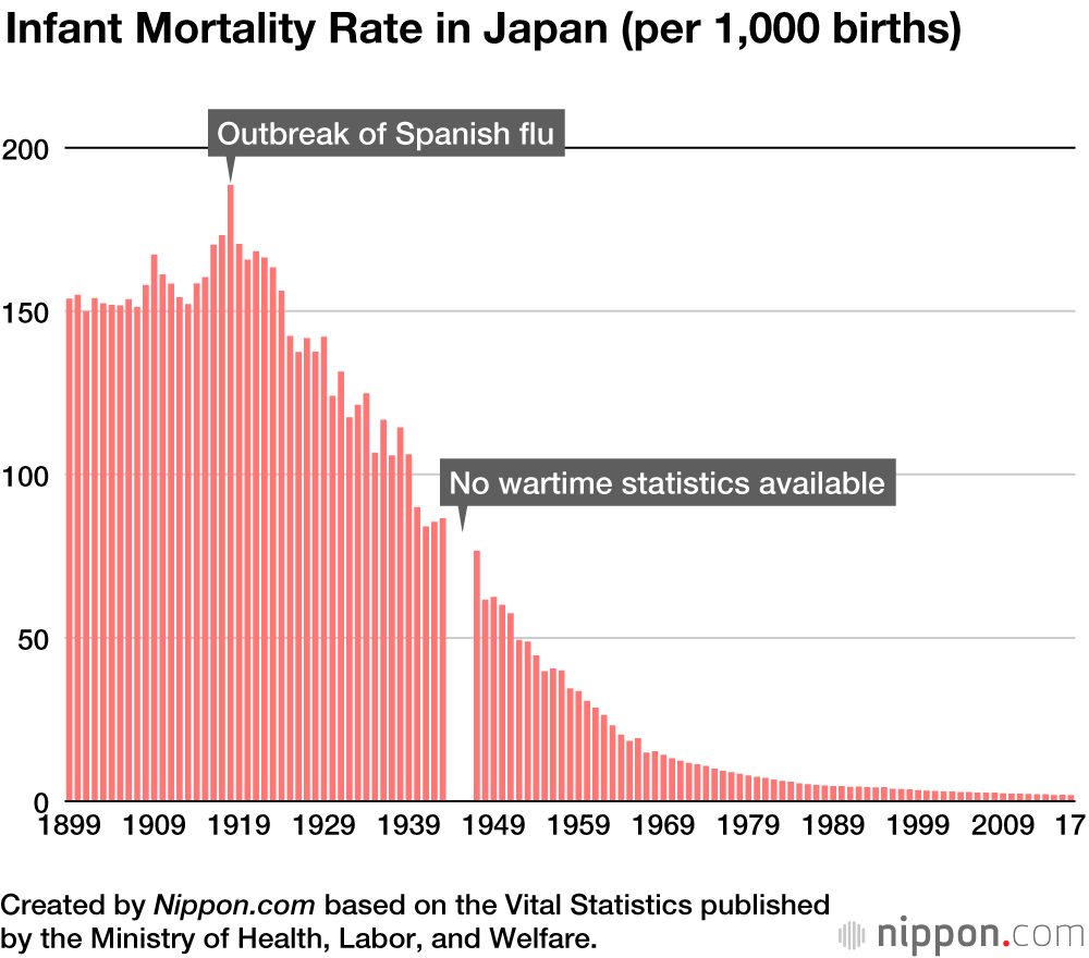 This graph shows the mortality rate by year from 1899 to 2017, with annotations for the peak of the Spanish flu (which we can see did not have a massive effect on infant mortality) and highlights the cause of the missingness during the second world war. While I would typically argue that rates should not be represented by bars (ideally used exclusively for counts), it makes the plot very easy to read and visually appealing. The biggest strength of this plot is simplicity – it is presenting a lot of data but only contains two dimensions (year and rate) which mean that patterns can be easily identified and inferences can be made quickly.
Be fruitful and multiply: Association of China’s universal two-child policy with birth rates
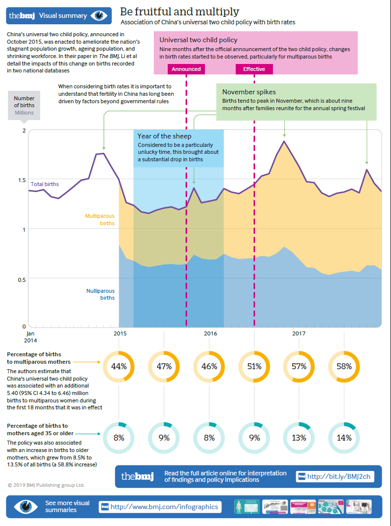
The above infographic published in the British Medical Journal describes factors influencing birth rates over time in China, with contextual annotations such as the date of the introduction of the two-child policy, the Chinese zodiac year, and annual celebrations. The infographic displays text, a combination of line and area graphs and a selection of pie charts. There is a good mix between white and colour, the font size is appropriate, and the text is well-placed.