Topic 2: Data visualisation aims
Data visualisation can be used for:
making data engaging and easily digestible
identifying trends and/or outliers within a data set
telling a story found within the data
reinforcing an argument or opinion
highlighting the important aspects or parts of a dataset
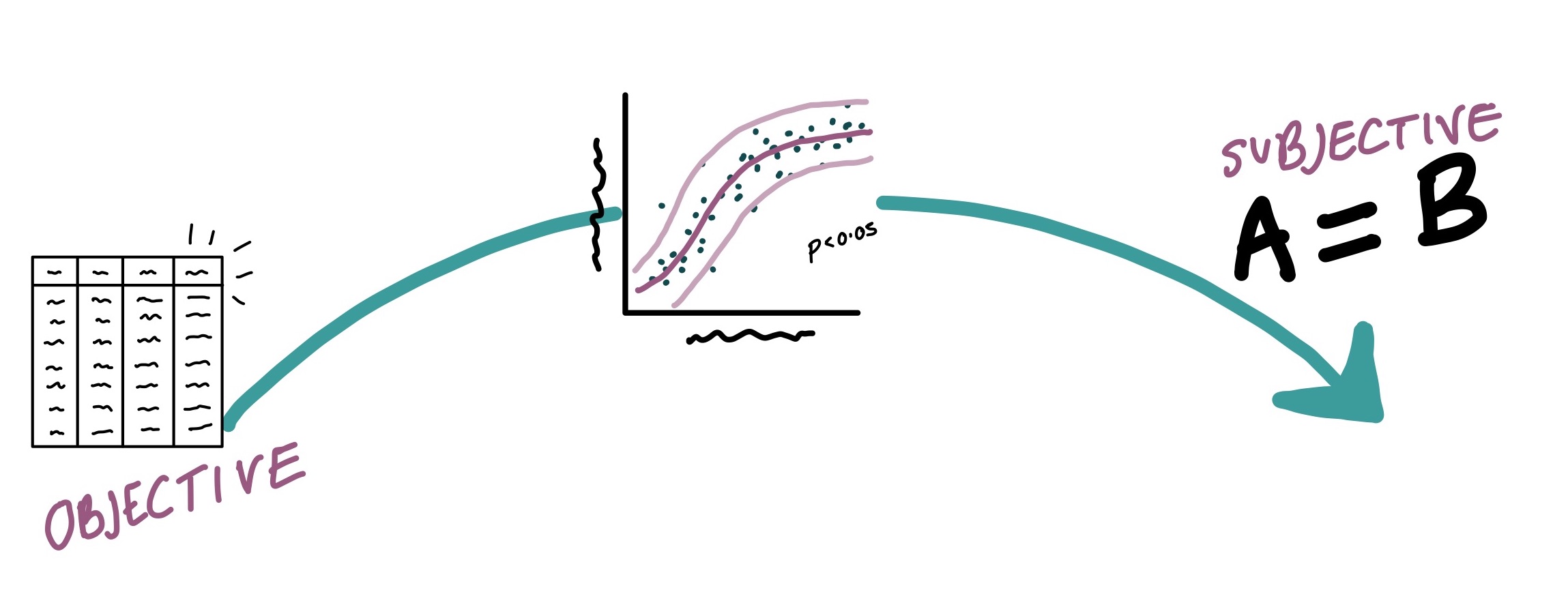
There are so many different pieces of information you can try to display using data visualisation, such as proportions, magnitudes, associations between multiple variables, differences between groups, and more. But for all of these objectives, there is also a spectrum of broader aims from objectivity to subjectivity.
If you were to be truly objective, hypothetically you would be presenting raw data with no processing conducted. In practice, this makes it impossible to get any message across. Any time you conduct any data processing, like removing rows or renaming variables, you are presenting some opinion about how the information should be presented best to get your message across. On the other hand, the most subjective approach would be simply to state your conclusion, with no explanation of how you reached that conclusion.
In practice, data visualisation happens within the middle of this space. You present the data in some way that allows the reader to easily absorb some message, without losing so much data that the message can not be validated.
There are numerous (seemingly endless) decisions you must make when creating a data visualisation, particularly when that data visualisation will then be used for data storytelling.
There are so many decisions you must make to transform the data from a spreadsheet to a graph or tabulation. Within the data itself, you might be selecting variables or excluding rows.
For a graph, you must choose the type of visualisation, and the aesthetic parameters such as the scale of the axes, the labels, and the colours.
You might add trend lines over multi-variable associations, like the ones shown in purple above.
You might include statistics, such as the statistical p-value or the confidence intervals (in light purple in the figure above).
You might add annotations, like little labels for outliers.
When tabulating the data, which summary statistics will you use?
What will be the rows and the columns?
How will you order them?
All of these considerations can have a substantial influence on the message that is taken away from your visualisation, and from your data overall. You must consider all of these elements when creating a visualisation, what they mean to your audience, and most importantly, how well they align with your aims and objectives.
Data visualisation principles cheat sheet
There is a super useful graphics cheat sheet by Marc Vandemeulebroecke, Mark Baillie, Alison Margolskee, and Baldur Magnusson, which you can use as a reference for some of the different considerations in creating an effective data visualisation.
In fact, the authors created the visualisation examples in R and the ggplot2 package in particular and shared much of the example code on github.