Topic 3: Data Storytelling
What is storytelling with data, and why is it important?
Stories are an effective way of presenting your ideas to other people. Stories have the power to inspire, influence, and change views. Thus, storytelling is one of the most efficient ways of communication. Data storytelling is the practice of building a narrative around data and associated visualisations to convey actionable insights in a commanding and engaging fashion. Data storytelling differs from data visualisation because it requires communicators to consider and provide a broad and holistic view of the idea you are trying to pitch. Storytelling with data first takes the audience, and narrative structure into consideration before any visuals are created. Therefore, before you start the storytelling process, you need to identify:
Who is the audience?
What does the audience care about?
What level of technical detail will the audience expect or appreciate?
What does the audience need to know about the data being presented?
How will the narrative be structured to generate the desired action?
How does the data being presented drive the decision-making process?
With these questions answered, you have got the road map in place to identify the technical level of your pitch and what information must be included in your narrative or left out entirely.
Data storytelling techniques to enhance your pitch
Keep visuals simple. This draws actionable insights into focus.
Create a headline for each slide. This articulates your actionable insights and connects your slides in an easily recognisable pattern.
Use photographs and icons. This will break up your text, making it more visually pleasing and memorable.
Do not present superfluous data. Only present the data that directly supports your pitch.
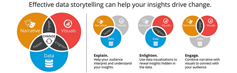
As with any good story, a data story needs a beginning, a middle, and an end, and some actionable insights. A good data story leverages three key components: data, visuals, and narrative. As data scientists, the data component enables you to obtain and communicate actionable insights. The visual component enables you to identify and translate patterns and trends in data. Finally, the narrative component allows you to tell the data story. All combined, narrative, data and visuals generate data stories that inspire, influence, change views and drive data-driven innovation.
Questions to ask when creating a visualisation for data storytelling
When creating a plot or data visualisation which you will use in data storytelling, there are a few specific type of questions you need to ask which can guide your reader to understand the story you are trying to tell with the data and your visualisation.
What is your story? What is the point? This determines your headline or title.
Note: when creating a data visualisation not intended for data storytelling, the title will be more objective and lacking any interpretation, perhaps explaining what variables within the dataset are shown.
How can you emphasise your point in your data visualisation? Answering this question determines your decisions around plot type, specific variables used, colors, highlights, annotations, etc.
What does the final plot show exactly? This is where you add things like a description, any legend or keys, and data sources.
You can read more about this approach on Lisa Charlotte Muth’s post “What Questions to Ask When Creating Charts: The Attempt of a Data Vis Worflow”
…..
Data storytelling with R
In the video below, Olga Pierce, a reporter specialising in data-driven stories, will show you how to turn a data finding into a data story with R:
Storytelling with R, by Olga Pierce
And here you can find her Slides and the Transcript.